Headstart UI Refresh
Headstart is applicant matching and management software for early talent teams. The companies mission is to help customers lead the way in fair recruiting, hiring diverse future leaders to improve business performance.
The problem
Since launching in 2016, Headstart has had several teams working on different parts of the product which has created inconsistencies, design debt making the UI look dated, and the product is not device agnostic in some use cases.
As we look to scale, the company is now looking to create a modern UI and to create efficiency, and consistency in Design.
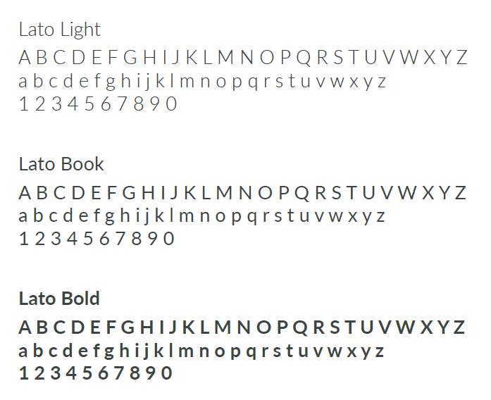
Headstart Guidelines (April 2020)
In April 2020 the Headstart guidelines comprised of the Headstart logo, a palette with 4 colors and our typeface (Lato)


The goal
To create a collection of reusable components (Design System), guided by clear standards and patterns, that can be assembled together to build our new UI.
For the end-user we need to improve the experience in terms of providing better quality and consistency.
Defining our design principles
Before jumping straight into developing a new color palette, iconography, etc, I worked closely with our UX Strategy Lead to define our design principles so as to help us make design decisions that reflect our core values at Headstart.
The design principles we defined:
User Centric
Product design is driven by the individual user experience and user persona’s not ‘feature requests’ or ‘functionality’ statements.
Ruthlessly Simple
Simplicity is a core design principle. Complexity is designed out through rigorous process design simplification – shortest possible route from A to B.
Inclusive
Inclusiveness it's an intrinsic part of any designed digital experience within a circumstantial context aiming to improve, not only the life of those often excluded but everyone's’ experiences.
Device Agnostic
Designed to work on all devices, with a prejudice towards mobile first.
Purpose not feature driven
We focus on our outcome at all times, and not be distracted by the feature or functionality
Mood boards
As the next step and inspired by Cooper’s Brand Experience Workshop I created a couple of moodboards on pinterest. I request all teams in the organisation; business development, sales, customer success, product, data science and leadership, to vote for their favorite version. This helped me understand and establish the right tone for our product and also helped with stakeholder alignment.
Moodboard 1: View on Pinterest
Moodboard 2: View on Pinterest
Color
Moodboard 1 was the preferred choice based on number of votes. Using this mood board as inspiration, I handpicked a palette for our product.
The key considerations when picking a new palette were:
• To create an engaging palette which would need to be validated as the system takes shape
• Solving for accessibility (Our goal for text components is to meet the WCAG 2.0 AA level 4.5:1).
• Solving for accessibility (Our goal for text components is to meet the WCAG 2.0 AA level 4.5:1).
I chose blue as one of our primary colors as blue has always been associated with links. *Blue is also often associated with trust, confidence, intelligence, aptitude, etc and we thought this relates well with our product and company mission.
As additional primary colors I added black and white as they work seamlessly with the blue and also solve for accessibility. I used Eightshapes contrast grid checker to test the foreground and background color combinations for compliance with WCAG 2.0 minimum contrast.
Illustrations
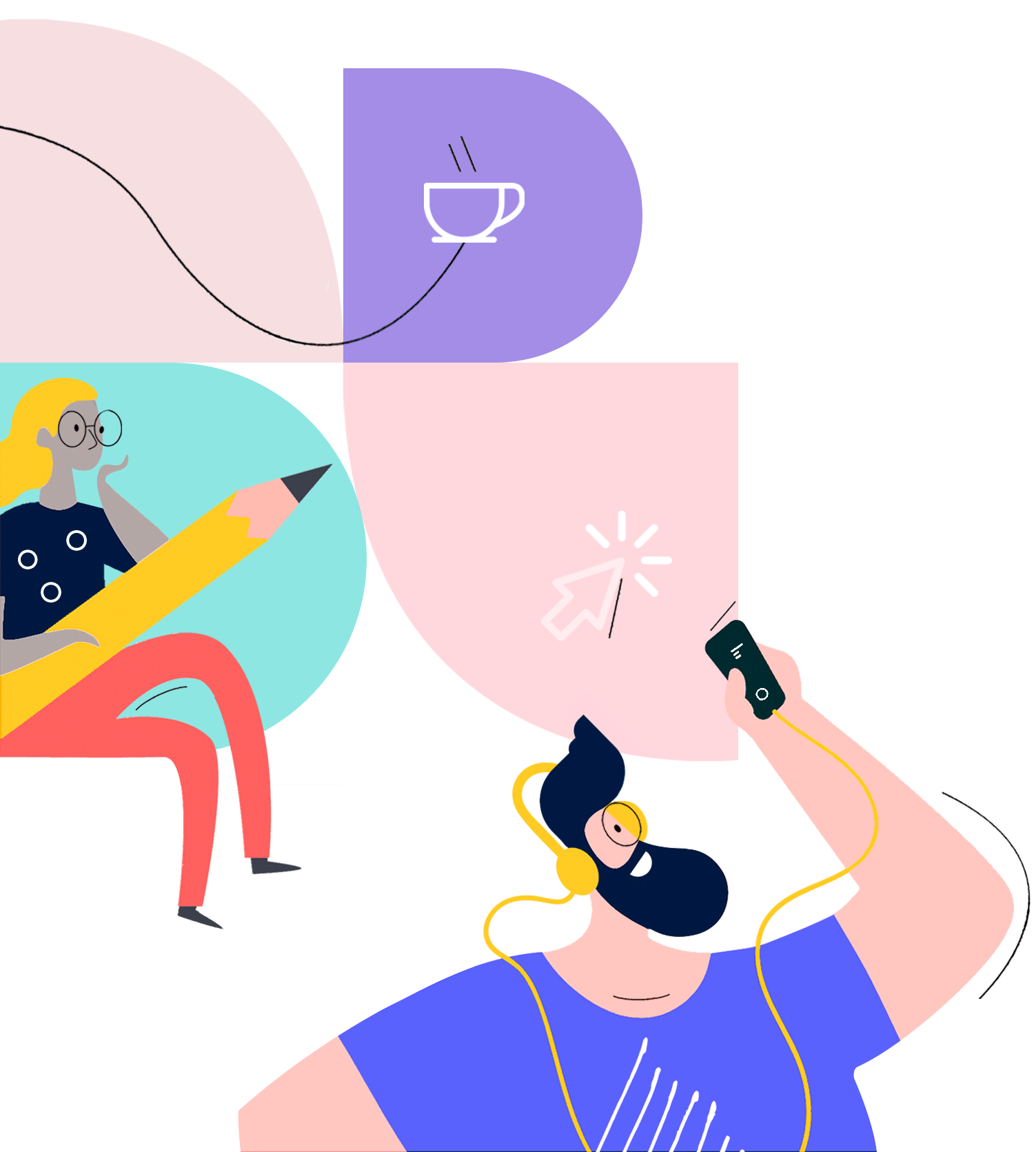
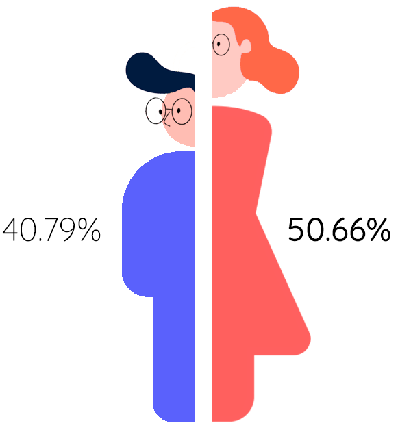
We are yet to define the finer details of our illustration style but as a start, I created a couple of illustrations to test our new color palette. These illustrations are currently live on our platform

Typeface
I chose Quicksand as our new product font.
Why did I choose Quicksand?
Quicksand is a sans-serif font that has geometric parameters, rounded ends, and modern design making it a versatile and legible font to use in small text sizes as well. Quicksand is a free font that has a good variation of weights (100-700), making everything feel less cluttered and organic. The rounded terminals with the curvaceous design along with the descender detail on the Q, creates a feeling of new, approachable, and openness, enforcing the idea of a non-rigid image, something that is aligned with our principles at Headstart.
Typography
While we have applied Quicksand throughout our app, we are yet to define our new scale which is currently work in progress. We decided to use a modular scale to limit the overabundance of choice and avoid errors when applying size to our typeface. We will be using Major Second (1.125 ) as our modular scale for the fonts. After conducting a UI audit we believe our app would work well if the difference between the <h1> down the <h6> isn’t too drastic.
Motion / Microinteractions
When adding motion, I wanted to make sure our micro-interactions and feedback states are consistent and fit in seamlessly.
I put together some core motion guidelines and principles to ensure we implement motion to support usability and to keep our motion style consistent.
Natural
Adding delight is great, but we want to make sure our motion follows natural movement and behaves as users expect them to. Sticking to rules of physics will help our app not feel like it’s come from outer space — and therefore will not feel alien. Our motion should follow rules of directionality, if you expect something to move from the left then it should. Using a natural movement can also signal to users the direction in which they are moving within a process. Easing can create and reinforce the ‘naturalism’ as a certain degree of skeuomorphism is inherent in easing.
Purpose
Don't use motion for the sake of “cool” as this can often hurt usability. We only add motion if we are able to justify the benefit to the user and how it can help users build mental models about how the system works and how they can interact with it. Motion is often helpful as a form of noticeable feedback that an action has been recognized by the system. Pretty but useless in context is a bad use of motion.
Use caution
We strongly believe in inclusive design so the products we build are welcoming to everyone. We use caution when adding motion, especially displaying moving or blinking elements. Although subtle movement and blinking can draw the user’s attention, these effects can also be distracting and they aren’t useful for people with visual impairments. Worse, some blinking elements can cause epileptic episodes. In all cases, avoid using movement and blinking as the only way to convey information.
Our user profile icon (menu) using our motion principles
Login page using our micro interaction principles
Headstart Design System (October 2020)
We have made great progress since April 2020 when we first started working on our Design System. We are using zeroheight to document all our design system resources. While we are still far from finished with our Design System, we have started building our new component library.
Component library
We currently use Ant Design Version 2.0 to build our UI. The version we run at the moment does have some accessibility concerns.
While we refresh our component library, our key goals with our new component library is to:
• Solve for accessibility
• Improve user experience by enabling our users to take shortest possible route from A to B.
Component library: Buttons
We chose to start with buttons as they are a fundamental UI element that play an important role in the interaction design of a system. We also believed it would be a great component to start with to test our new colors, fonts, and motion principles.
Apart from the standard guildelines for buttons, some of the key considerations we wanted to address when designing our button component were:
• Solve for accessibility
• Provide visual feedback
• Label buttons for what they do
Design for accessibility
Our goal for text components is to meet the WCAG 2.0 AA level (4.5:1)*. Level AA is the level that most development teams aim to meet. This is the level that is typically referred to when you're tasked with "making a website accessible".
For all our components we have a contextual variations checklist that we use in order to work out how would this component behave when the users...
Can’t see?
Either because they are blind, suffer from low vision, or because of the effects of sun flare while outside on campus recruiting students?
✔ button aria label is in place allowing screen-readers to dictate the button actions to the user.
✔ button label font-size is adjustable as per user browser definitions.
Can’t understand?
Either because they are neuro-divergent, because they are not native speakers, or because they are under intense stress due to the pressure of managers to deliver pipeline related results?
✔ button labels have no acronyms, jargon, vague nor complex labels.
✔ button hierarchy is not conveyed by a single differentiator. (ie. color).
Can’t touch?
Either because they suffer from permanent paralysis, they're holding a baby, or because the battery mouse runned out?
✔ button outline is clearly perceivable while navigating without a mouse.
Can’t move?
Either because they have a spinal permanent injury, they're on very slow cue at the supermarket, or because they're having a phone interview in an office booth?
✔ button outline is clearly perceivable while navigating without a mouse.
Provide visual feedback in order to:
• Signal to the user that these components are clickable
• Delight our users
• Indicate that the system is active
Our primary button
Label buttons for what they do
Using the wrong words on button labels can cause users confusion, more work, and slower task times. To make it easy for users to take action, it is important to choose the right words on button labels. We are yet to define our product tone of voice but this was a good place to start. We use a conversational tone and language that our personas (Claire - recruiter person, and Davan - candidate persona) are familiar with. We use the kind of language you would use if you were talking with these personas, and avoid a too technical tone.
Button Hierarchy/Do's and Dont's
I added some guidelines to establish a visual hierarchy for our button design. I also documented some best practices in the form of some Do's and Dont's.
Primary button: Enabled, Active, Disabled, Loading states.
Secondary button: Enabled, Active, Disabled states.
Tertiary button: Enabled, Active, Disabled states.
I also created a bespoke Sign-in button. Diversity and Inclusion is at the heart of everything we do at Headstart. As we continue to build our Design System we are looking for meaningful ways to incorporate our company mission along with our design principles to create a delightful experience for our users.
Our bespoke Sign-in button
Launching our new UI
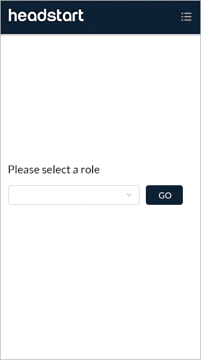
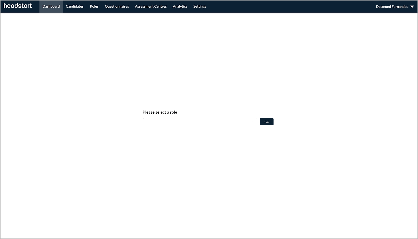
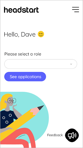
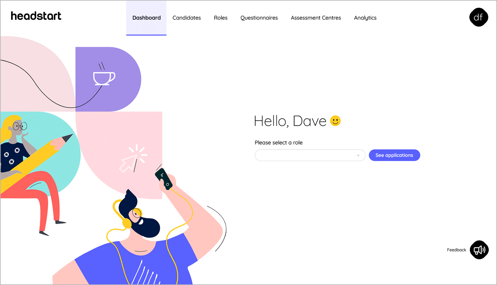
We are incrementally updating our new UI across our product. Below are a couple of screens showing the UI before and after states for mobile and desktop.
April 2020 (Before we had our design system):
October 2020: (Incrementally updating our new UI):
Measuring the impact of our new UI
As we continue to evolve our design system we also want to measure the impact of our new UI. We intend to do this using subjective and objective measurements.
Subjective
• Surveying end-users and internal teams to get a pulse on how people’s opinion might change.
• For end-users, this will be in the form of an NPS surveys. We would like to increase the NPS score for every iteration. We are not putting a % increase target at this point as we are only getting started.
• For internal teams, this will be an internal survey to gauge improvements in workflow and adoption.
Objective
We also want to measure the impact in a objective way by asking ourselves.
• Does the Design System have a component library?
• Does the Design System have robust documentation?
• Does the Design System have a process?


